Chapter 3: Charts and Pivot Tables
In this chapter, you will learn how to:
- present your data as column and pie charts
- summarize data using pivot tables
- view cell edit history and sheet version history
Create Charts From Data
A chart is a graphical representation of your data. Charts are based on and driven by data you have entered in your worksheet. To build a chart, first enter the data you want to chart. Include labels above and/or to the left of the numbers that describe the data. And finally, select the cells that contain the labels and numbers to chart.
Let’s say we want to chart the income data found on the Budget sheet of the Powder Day file.
- Navigate to the Budget sheet.
- Select cell b6 and AutoFill the month headings across through column H.
- Select cells a6:h9, which includes the data we want to chart and the column and row labels that describe it.
- On the toolbar, click the Insert chart button, or on the menu bar, click Insert > Chart.

The chart appears as a graphic object layered above the cells of the worksheet, and the Chart editor pane appears on the right side of the window. We use the Chart editor pane to improve the appearance of the chart. - Move the chart down a bit so it does not overlap so much of the worksheet data.
To move the chart, point into an empty area within the chart frame and click-and-drag to the new location. - Resize the chart to fit the available space better.
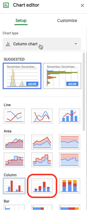
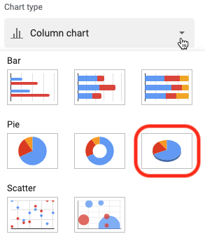
To resize the chart, click-and-drag the blue square resize handles found on its border. The corner handles resize proportionally. - On the Setup tab of the Chart editor pane, click the Chart type menu to see the available chart types, and click the Stacked column chart type.
- In the Chart editor pane, scroll down to the bottom and check the box to Switch rows/columns.
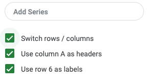
In charts that plot data over time, it is customary to use the horizontal (X) axis for time and the vertical (Y) axis for the series of data. - Click the Customize tab of the Chart editor pane.
- Expand the Chart style heading.
- Turn on the checkbox 3D.

- Expand the Chart & axis titles heading.

- Click the Title type selector menu and choose Chart title, if necessary.
- Change the Title text of the chart title to Income Nov—May.
- Under Title format, click the Alignment menu and choose Center to center the chart title over the chart.
- Click the Title type selector menu again and choose Horizontal axis title.
- Delete the Title text Category to remove it from the X-axis.
- Expand the Legend heading.

- Click the Position menu and choose Bottom to move the legend to the bottom of the chart.
- Close the Chart editor pane by clicking the X in its top-right corner.
- If the chart is no longer selected, click anywhere on the chart to select it again. Whenever a chart is selected, an icon of three vertical dots appears in its top-right corner. Click this icon and notice the actions available.
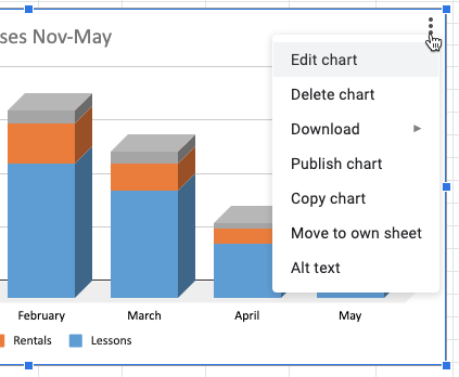
- Choose the Edit chart command from the Options menu shown above.
This opens the Chart editor pane again. Alternatively, you could double-click on the chart to open the Chart editor pane. - Click the Customize tab of the Chart editor pane.
- Expand the Series heading.
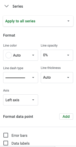
- Near the bottom, turn on the Data labels checkbox to display the income values on each data point marker.
- Move and resize the Income chart to make room for another chart.
Make Charts from Discontiguous Data
A chart may be based on discontiguous data in a worksheet; the data does not have to be in a contiguous range of cells. Let's make a pie chart that plots the total expenses.
- On the Budget sheet, select cells a11:a15, the Expense labels.
- Holding down the Control key (Windows) or Command key (Mac), additionally select cells i11:i15, the Expense totals.
- On the toolbar, click the Insert chart button, or on the menu bar, click Insert > Chart.
The second chart appears. - Resize and move this chart alongside the other chart.
- In the Setup tab of the Chart editor pane, click the Chart type menu and choose the 3D pie chart.
- On the Customize tab of the Chart editor pane, expand the Chart & axis titles heading and change the Chart title to Total Expenses.

Summarize Data Using Pivot Tables
A pivot table is a data summarization tool capable of consolidating a large list of data into concise, interactive summaries. A list of data needs three things to be successfully summarized using pivot tables:
- a header row of labels immediately above the first row of data
- two or more columns containing text or dates that describe each entry
- one or more columns of values to be summarized
We will use the long list of ski and snowboard lessons on the Lessons sheet of this Powder Day workbook to learn about pivot tables.
- Switch to the Lessons sheet.
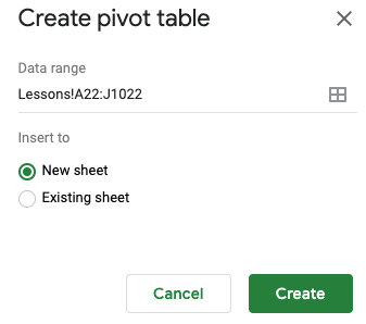
- Select any cell in the list of lessons that begins in row 22. You do not have to select the entire list; Sheets can find the boundaries of the list on its own.
- On the menu bar, click Insert > Pivot table.
- In the dialog box that appears, click Create.
A new sheet called Pivot Table 1 is added to the workbook, and the Pivot table editor pane appears on the right side of the window. - To change the name of the sheet, double-click the sheet tab Pivot Table 1 and type Lessons Pivot and then press Enter/Return.

- In the Pivot table editor pane, click the Add button next to Rows.
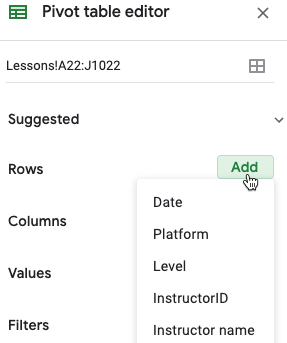
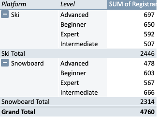
- From the menu of our Lesson field names (column headings) that appears, choose the Platform field.
Instantly, the two platforms on which we teach lessons, Ski and Snowboard, appear as row headings in the pivot table. - Likewise, in the Pivot table editor pane, click the Add button next to Columns and choose the Level field.
Our four levels of classes appear as column headings in the pivot table. - Click the Add button next to Values and choose the Registrants field.
The number of people who have registered into our classes are instantly summed by Platform and Level, with grand totals along the edges.

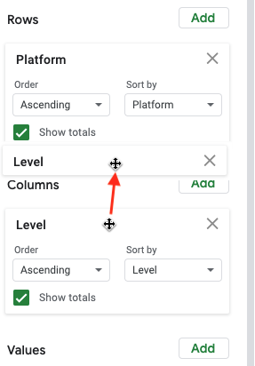
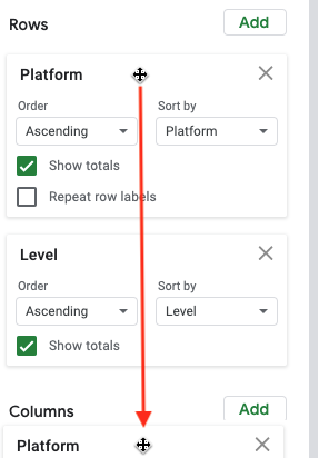
Let’s say we think the pivot table would look better if we put Platform across the top and Level down the left side, reversing their roles as column and row headers. - In the Pivot table editor, drag the Level field up out of the Columns area and into the Rows area, dropping it below the Platform field, as illustrated below.
Notice how the pivot table has responded to this change.
- Similarly, drag the Platform field down out of the Rows area and into the Columns area, as illustrated below.
This is why they are called pivot tables. You just pivoted the whole table ninety degrees, transposing the row and column headings. - Now let’s add a filter. In the Pivot table editor pane, click the Add button next to Filters and choose the Instructor name field.
- Click the new filter menu.
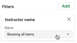
- Click Benjamin Holden and Eric Gomez to turn off the checkmarks by their names, that is, to filter them out.
- Watch the numbers in the pivot table as you click the OK button. Without Benjamin and Eric’s lessons, the numbers decrease.
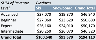
Now we want to sum Revenue rather than Registrants, and remove the Instructor filter. - To remove the Instructor filter, click the X by Instructor name in the Filters area of the Pivot table editor pane.
Immediately, the numbers return to their unfiltered values. - To replace Registrants with Revenue, remove Registrants in the same way you removed Instructor name; click the X next to Registrants in the Values area. Then click the Add button next to Values and choose the Revenue field instead.
The pivot table now sums Revenue by Platform and Level.
View Cell Edit History and Sheet Version History
To see the version history of an entire workbook file, go to the menu bar and click File > Version history > See version history.
The Version history pane appears on the right side of the window, listing the date and time of each version.
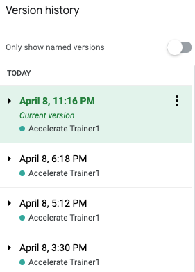
To restore a previous version and make it the current version, click on a version in the Version history pane and then click the green Restore this version button that appears at the top of the window.
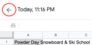
To close the Version history pane and resume working on the current version, click the left-facing arrow near the top of the window (not your web browser’s Back button).
To view the edit history of a single cell, right-click the cell and choose Show edit history.
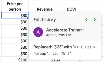
In the pane that appears, use the small arrows in the upper-right corner to go to the previous or next edit of the cell.
When done, close this Sheets file by closing the browser tab containing it.